As crafters/artists and makers we know just how important colors are.
Colors can make or break your projects. When a color palette is done well in a
project it will direct the viewer’s eye. When a color palette is not done well
the viewer can be unfocused and straight up confused by what they are looking
at.
When creating color palettes for your projects there are a
lot of things to think about.
*If you are
making a project for a gift such as jewelry or accessories, you will want to
consider who will be wearing it so it will compliment colors they like to wear.
* If you make
items for a gift such as home décor or something that will be displayed take
into consider the colors in the person’s home.
* Does the
recipient of the project have a favorite color?
*Is the
project for a special holiday or occasion such as a party or wedding which may
already have a color palette.
*What are the
current color trends? This will be important if you are planning to sell your
items. When reaching out to a bigger audience the trending colors will draw
their attention quicker as it will be what the consumer is used to seeing at
the moment.
Colors also carry different emotional
symbolism.
·
Red —passion, or
energy.
·
Orange — joy and
enthusiasm
·
Yellow — happiness and
intellect
·
Green — growth or
ambition, green
·
Blue — tranquility and
confidence
·
Purple — luxury or
creativity
·
Black — power and
mystery
·
White — safety and
innocence
Types of color schemes
Monochromatic color scheme is when a single color with varying shades and tints on the color wheel are used to produce a consistent look and feel. Although this scheme lacks color contrast, it will often ends up looking very clean and polished.
Analogous color schemes are formed by pairing one main color with the two colors directly next to it on the color wheel. Analogous structures do not create themes with high contrasting colors, so they're typically used to create a softer, less contrasting design an can be very harmonious and relaxing.
Complementary color scheme is the use of two colors directly
across from each other on the color wheel and relevant tints of those colors.
The complementary color scheme provides the greatest amount of color contrast.
This color scheme can be vibrant with high contrast if colors are used in the
same saturation.
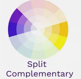
Split complementary scheme includes one dominant color and
the two colors directly adjacent to the dominant color's complement. This
creates a more nuanced color palette than a complementary color scheme while
still retaining the benefits of contrasting colors.
Triad color schemes offer high contrasting color schemes
while retaining the same tone. Triadic color schemes are created by choosing
three colors that are equally placed in lines around the color wheel.
The Tetradic color scheme uses four colors equidistant from each
other on the color wheel to create a square or diamond shape. But this can produce a full rich color scheme.
Here are a few color scheme creators you can find on the
web.
https://paletton.com/#uid=1000u0kllllaFw0g0qFqFg0w0aF
https://coolors.co/
https://www.canva.com/colors/color-palette-generator/
Now that you have your color palette how do you use it?
60-30-10 RULE
This rule allows you to put a balanced color scheme together
more easily.
60 represents 60% and is the primary colors you will be
using.
30 represents 30% and is the secondary colors you will be
using.
10 represents 10% and is the accent colors you will be
using..
While these aren’t hard-and-fast numbers, they help give a
sense of proportion and balance to your projects